kitchen backsplash update.

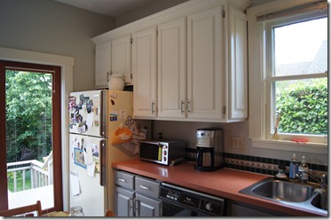
if you have been following the blog over the past couple of weeks, you know that i am in the process of updating our kitchen. no big remodel, just paint!

a few weeks ago, i started by painting the walls a light blue-ish grey – moonshine by benjamin moore – but the actual paint i used was the new valspar allergy & asthma, which i also used for the living room, that i had lowe’s colormatch for me.

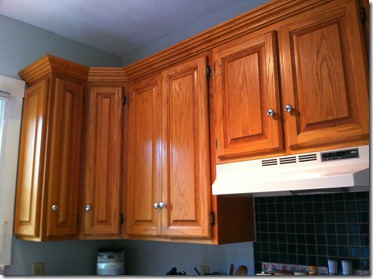
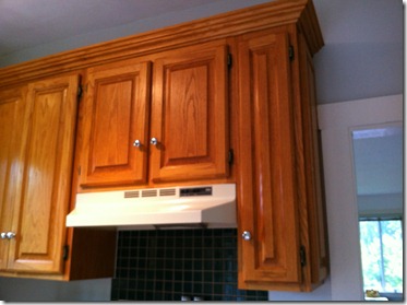
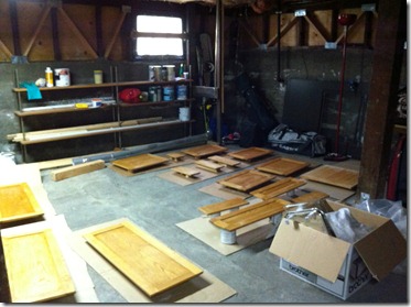
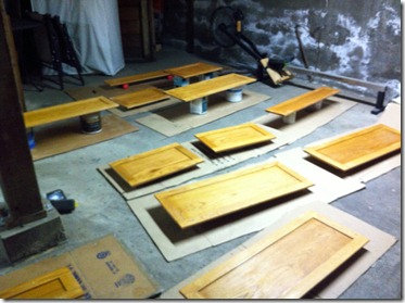
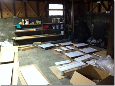
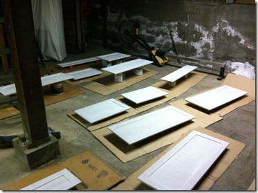
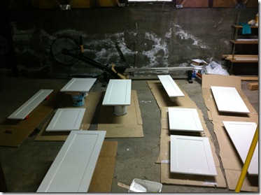
then, i sanded, primed, & painted the kitchen cabinets as seen in this post.

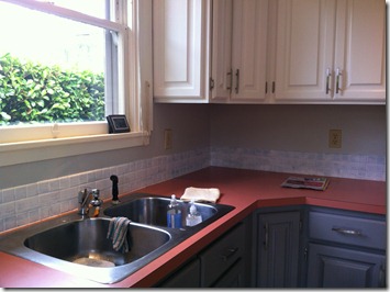
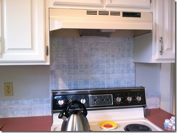
next step: painting the backsplash tile.

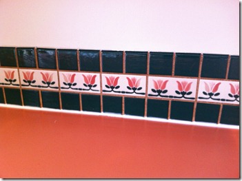
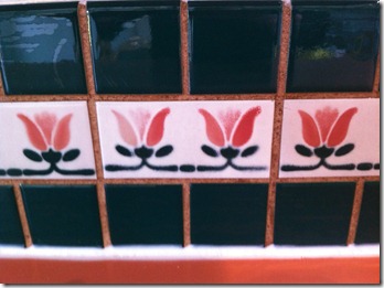
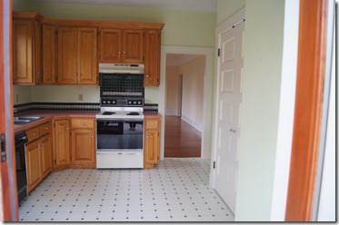
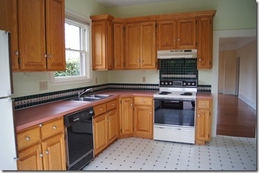
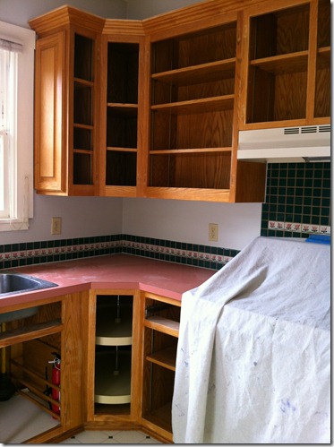
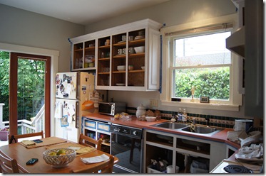
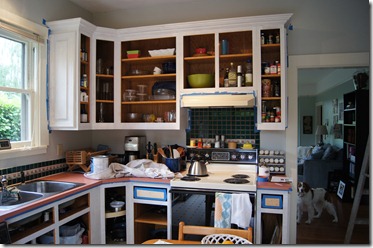
we had this really lovely backsplash tile that was forest green & pink tulips. while it matched the pink laminate countertops really well, there was no room for flowers in our kitchen update & it had to go! i knew it would be really expensive to rip out the old tile & replace it with new (& tiling isn’t something i am quite ready to learn how to do yet), so i was going to try my hand at painting it. i figured, worst case, we would have crazy-looking tiles for a while until we saved up our pennies to re-tile. it seemed worth the risk.

i started googling (aaron, pretend i said binging) a phrase like “how to paint kitchen tiles” & i found this tutorial on painting backsplash tile. perfect i tell you, like it was meant to be!

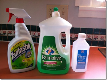
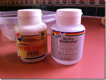
i pretty much followed her tutorial, including cleaning supplies & paint supplies. in the end, i needed many, many, many more coats of paint than the original tutorial called for, but that was likely because i was trying to make such dark tiles a very light color (read: white). honestly, this was a big project & took many hours & lots of patience, but it was SO worth it!

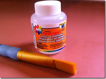
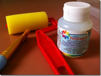
supplies:

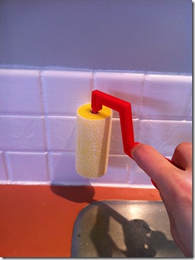
after my order from misterart.com came in (where i ordered the surface conditioner, enamel paint, enamel paint dilutant, gloss finish, & foam roller), i gave myself a little pep-talk & went for it.

IMG_2208

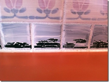
{deep clean of the tiles}

IMG_2209

IMG_2210

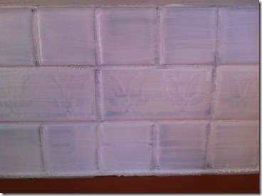
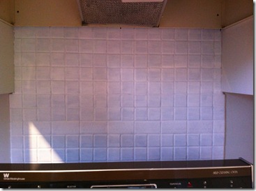
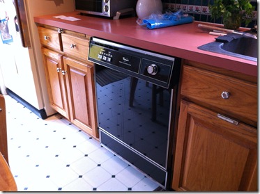
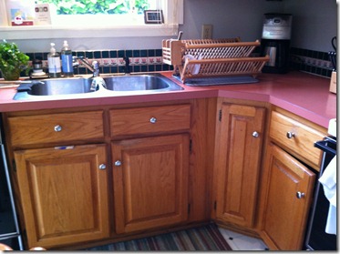
{this is what i was working with. it is crazy to see these pictures after seeing the tile after the painting process!}

after a good clean, i started with the surface conditioner. i used a small craftbrush & coated the tiles with the surface conditioner. then i let it dry.

IMG_2211

after the quick drying process on the surface conditioner, i got ready to start with the first coat of white paint. i put a glob of paint into an old GladWare container & then added drops of the dilutant until it was the consistency of Elmer’s Glue. {sidenote: the first few coats i diluted down to a glue consistency, but on the later coats i kept the paint a bit thicker.} then i started painting. i used the same small craftbrush so i would have more control on the edges. i painted in small sections, & found that painting the grout first & then going back & painting the tiles made the process a lot easier. once i started the second, third, etc. coats, i didn’t focus on the grout & just painted the tiles.

IMG_2212

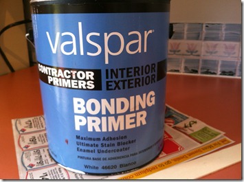
after one coat of paint, i noticed a lot of the paint on the edges wasn’t sticking. boo. i briefly considered re-cleaning the tiles & then adding another coat of surface conditioner, but then i remembered the bonding primer that i used to prime the kitchen cabinets. when i bought it, the gal told me it would basically prime to anything. sure enough when i went to the basement to check the label, it listed ceramic tile as one of the bonding surfaces.

IMG_2213

so i went off-tutorial & painted a (thick) coat of bonding primer. after the primer was dry (i waited at least 12 hours between coats for the entire project), i started in – again – with the enamel paint.

IMG_2214

IMG_2215

IMG_2216

IMG_2217

after about the second coat of enamel paint, i knew that i would need many more coats than the three that the tutorial suggested. so, i kept painting. & painting. & painting.

IMG_2218

IMG_2219

IMG_2220

IMG_2222

IMG_2223

IMG_2224

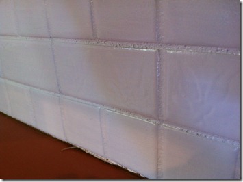
aaron & i figured out pretty quickly that i was never going to be 100% satisfied with the whiteness of our tiles regardless of the number of coats i painted. the tiles that had tulips were still showing an outline of the tulips, but the dark green color was slowly starting to fade. i finally had to call it after seven coats. yep, seven. i still had almost a full bottle of white enamel paint left (i had already used three) but wanted to make sure i had some paint around for touch-ups in the future.

IMG_2238

as per the tutorial instructions, after my seventh – & final! – coat, i quickly went over my freshly-painted tiles with the foam roller in order to smooth out the brushstrokes.

IMG_2239

after the paint was dry, i let it dry almost a full 24 hours, i put on two coats of gloss glaze, allowing for drying time in-between coats.

IMG_2252

IMG_2253

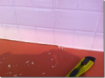
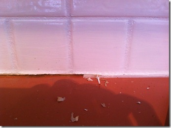
after the glaze was dry, aaron & i used a small razor to cut away the old caulking from between the tile & the countertop. this was mostly in preparation for my next step: updating the laminate.

IMG_2254

IMG_2255

IMG_2256

IMG_2257

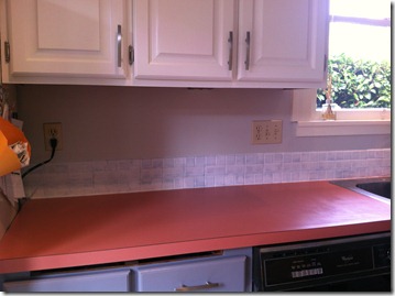
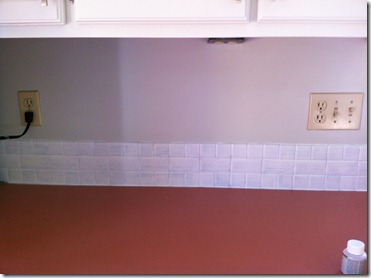
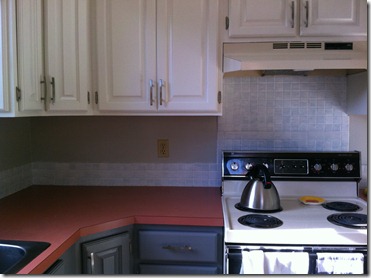
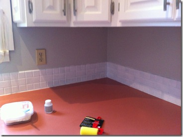
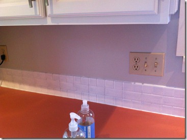
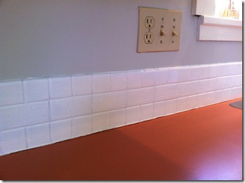
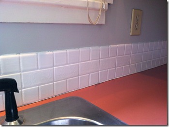
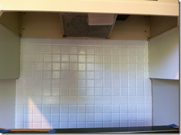
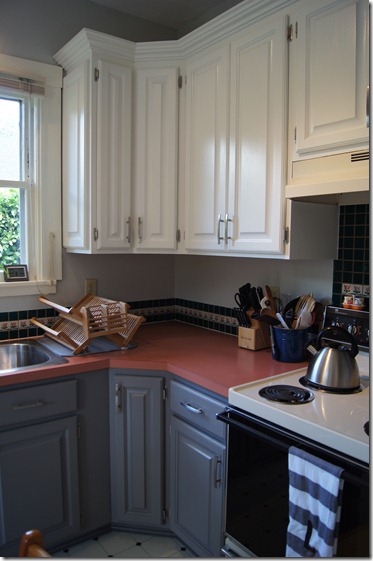
it is easy to be picky about the tiles not being perfect (i.e., look like brand new white tiles), but for $30 in supplies we have a new backsplash & i couldn’t be happier. the change from the forest green & flowers to the bright white made such a huge difference in our kitchen. really, it was an amazing transformation.

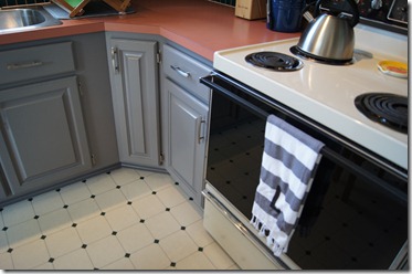
the downside: it highlighted our very pink laminate countertop. boo. one of our friends commented that we had a nice colorblocking going on with the grey cabinets, pink countertop, & white backsplash & upper cabinets, but we weren’t really diggin’ it.

up next, an update to the countertop!

have you ever considered painting a backsplash?

M

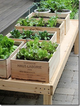
pinspiration: wine box garden.

this is a bit of a belated post, especially since it was completed back in may!, but better late than never, right?

as soon as we moved into our house i knew i wanted some kind of a garden. since i didn’t want to take on too much (like building raised garden beds), a small herb garden seemed fitting for our first garden. especially since i am not exactly known for having a green thumb.

almost as soon as i pinned this idea on pinterest, my friend amanda commented that she had two wine boxes that would be perfect for the project. i knew it was meant to be!

bandage

{the original tutorial link: diy wine box vegetable garden.}

supplies:

  • wine box(es)
  • dirt
  • seeds or plants
  • drill for making draining holes
  • 1×2 & screws if you want legs
  • cork, sharpie, & bamboo skewer if you want to make signs

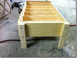
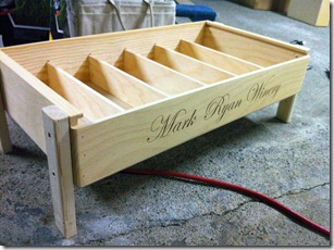
the wine boxes that amanda gave me were gorgeous. they were high quality & already had the dividers inside. my dad added the wooden legs by screwing on pieces of a 1×2 (i think) & then snapping off the end of the top screw so that i wouldn’t cut myself when i was planting. my mom drilled a couple of drainage holes in each section as well.

IMG_1966IMG_1967

my mom & i decided the best place to put the garden boxes was over on the side yard (east of the house). here, it would get sun & rain, but not be in the way (like they would have been on the porch, which was the original spot for them).

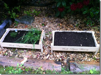
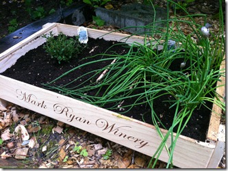
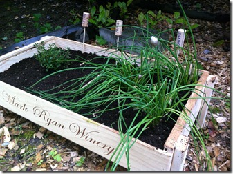
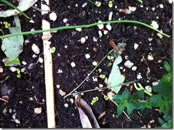
we filled the boxes up with dirt, & then planted seeds for basil & baby greens, & plants for thyme & chives. we also added a rosemary plant in a separate planter as it was too big for the wine box.

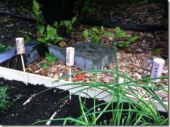
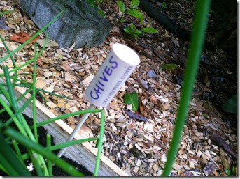
i had some corks lying around from our wedding (we used them in our centerpieces & in the bulletin board my mom made for our seating chart) & we used those for marking the different herbs. i used a (purple) sharpie marker to write what the name of the herb was, & then we stuck the cork onto a bamboo skewer, & then stuck the skewer into the dirt near the plant.

IMG_1968

{left box from l to r: thyme plant, basil seeds, chive plants. right box: baby greens seeds.}

IMG_1969IMG_1970IMG_1971IMG_1972

it has been really fun to have our own herb garden & be able to use the herbs in our cooking. it is so much cheaper to grow an herb plant than to buy the cut herbs at the store. i think next year i will also add parsley to the mix.

IMG_2101

{those tiny little green leaves are my basil plants! once they start growing more, i will have to thin them out.}

IMG_2103

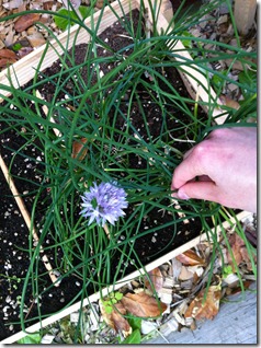
{the chives are flowering!}

IMG_2104

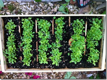
{the baby greens!}

do you have a garden – herb, veggie, fruit, or otherwise? what is your choice of planter?

M

my weekend in pictures.

IMG_2274

{we have a very big & expensive hole in our yard as a result of a few plumbing issues. this is the not-so-fun part of homeownership!}

IMG_2276

{sadie & i enjoyed some deck time before i went to yoga on friday morning.}

IMG_2278

{jez (our jetta) just rolled over 70,000 miles. not bad for a 2003. not bad at all.}

IMG_2279

{we enjoyed a yummy dinner at boom noodle on friday. delish!}

IMG_2280

{we saw the new woody allen movie with my grandmother. it was funny & definitely gave us the travel bug. rome anyone?}

IMG_2283

{we finally visited the restore in ballard. it is filled with fixtures from houses that are usually discounted quite a bit. there was a little too much for us, but maybe if we are looking for something more specific. #overwhelmed.}

IMG_2286

{while we were in ballard, we stopped to have lunch at the ridgeback café. this is justin’s restaurant, the husband of our realtor PJ who made all of the delicious crepes at our housewarming party.}

IMG_2289

{sadie was so proud of herself & the hole that she dug under the fence. we were invited to our across-the-street neighbors’ house on saturday for dinner (due to our plumbing issues this week) & decided to leave sadie in the backyard. shortly after we had finished dessert, we get a visitor to our dinner party in the form of sadie showing up at the neighbors’ house like she owned the place. we were sure she had hopped the fence & followed our voices, but soon enough we discovered she is a digger. boo.}

IMG_2290

{aaron, sadie, & i took a family walk over to greenlake on sunday morning. it was sunny & beautiful!}

IMG_2291

{i don’t know why yoga in the park is such an omg, especially in seattle, but i guess it is.}

IMG_2292

{sadie toweling herself off after a much-needed bath.}

IMG_2293

{we were downtown running a few errands & i gave aaron the tour of the new nordstrom rack.}

IMG_2294

{burrito bar at whole foods. yum-o.}

IMG_2295

{san pellegrino & mango/peach nectar. delish! next time i think we will try it with some prosecco!}

we have had the most beautiful weather since july 4th & it finally feels like summer! how was your weekend?

M

this old house.

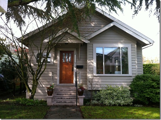
our house was originally constructed in 1908, making her 104 years old!

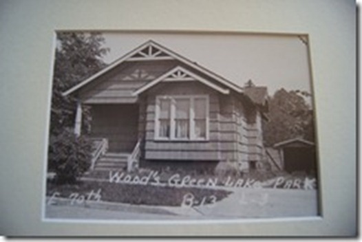
as part of our closing gift (along with the fabulous housewarming party) our realtor PJ – his name is Padraic, but i had trouble saying it when we first met so i dubbed him PJ instead – gave us a print of our house as it originally looked.

DSC01121_thumb

{1908}

IMG_1624

{2012}

clearly there are a few changes to the outside of the house: the entryway and front bedroom closet were added when the front porch was enclosed, and the garage/shed was torn down. i am glad we have a small entry space as well as a pretty decent closet in the front bedroom (as it holds extra clothes, craft supplies, etc. that we don’t want to have to go to the basement for every time we use them). while it would have been nice to have a garage or shed in the side yard, it is nice to have such a big yard space (relatively speaking of course).

i was also always curious whether the front window popped out was an original design, or added later. i guess i have my answer!

the house, after over 100 years & a few updates, looks much more like a craftsman that it did when it was originally constructed.

have you dug thru the archives & found an old picture of your house?

M

updates to the living room: art & curtains.

i didn’t grow up with window coverings, mostly because i grew up in the country, but i do like curtains on windows if they are done right. i love the idea of adding a fun texture, color, or print thru a curtain, & that is what i set out to do when shopping for our living room.

i wanted something that was fun & could give us some privacy if we needed (especially on the front window) & also could be lined, if necessary, to help keep out the winter chill. when i started my search, i toyed with the idea of making curtains, but then i considered that our ceilings are vaulted & two of the three windows are big (over 80 inches), i scrapped the idea of making them. i figured it would cost me way more in fabric than just buying curtains, plus i risked having to have a seam in the middle of the fabric. no dice.

so, the search began. it didn’t take long for me to figure out that finding six 108 inch panels would could cost a small fortune. i have been a fan of west elm for a long time (our bed frame & sheet-set-turned-duvet-cover are from here) & we recently got a store downtown (yay!). i have found myself finding more & more things that i like for the house at west elm, including the perfect set of curtains!

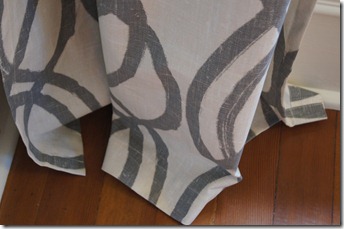
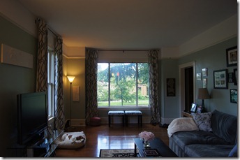
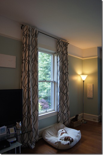
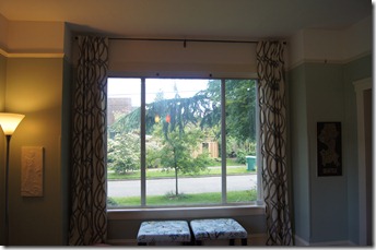
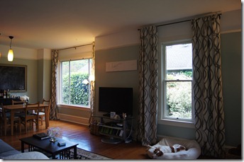
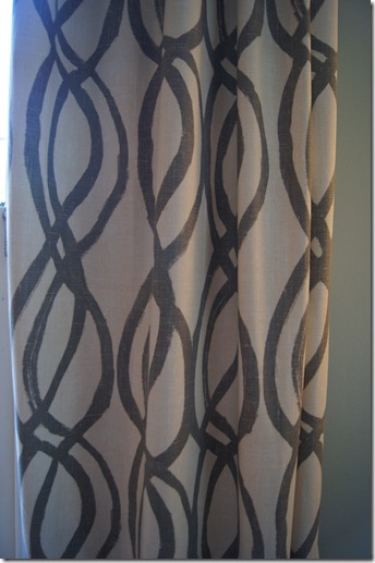
i found these scribble lattice curtains & instantly fell in love. {spoiler alert: these are the ones i bought!} they were fun, grey, & long enough. i held out for about a month or so because even though these curtains were priced well, i needed six of them. i finally headed down to the west elm store last month to see if they had them in stock. well, there weren’t any in stock, but {the good news!} all curtains happened to be on sale plus free shipping (i also had a 10% off coupon west elm sent me when we moved). i ordered them on the spot. {the bad news} they were backordered for three weeks. the original shipping date i was told would have had them delivered this week. luckily, they were shipped early & we were able to hang them the night before our housewarming party two weekends ago {much to aaron’s dismay. he was a trooper though & since i made it easy & marked & measured everything out, he couldn’t say no!}.

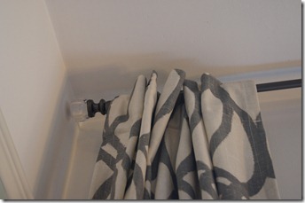
curtain rods, surprise, surprise, can also be expensive, especially since we had two long windows. we had a curtain rod left over from our old living room which would fit the small window, so i just bought two matching ones! {the rods aren’t available online, but i have seen them in stores recently. the rods are a dark grey metal with “glass” balls on the ends.}

we hung the rods two inches from the ceiling & it makes the ceilings look even taller! seriously, it doesn’t seem like it would make a difference, but it does. plus, the curtains pool just a few inches on the floor (which is what i wanted), so no hemming for me!

i apologize for some of the dark pictures. ideally i would have taken these in the morning when the sun is shining thru the living room windows, but we haven’t had much sun lately. {surprise, surprise, i know.}

DSC01124

DSC01126

DSC01127

DSC01128

DSC01129

DSC01130

DSC01131

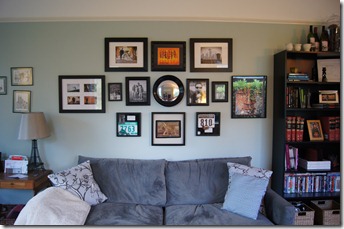
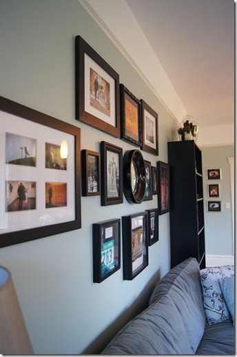
we also decided it was time to hang some art in the living room (as i was tired of the coupons being hung on the walls & worrying about the art being stacked on the living room floor). we had a gallery wall in our last living room & used many of the same pictures, but made the centerpiece this convex mirror i picked up at, you guessed it, west elm. {it isn’t available online anymore, but there was one left at my west elm store – the display – & i talked them into selling it to me!}

DSC01132

DSC01134

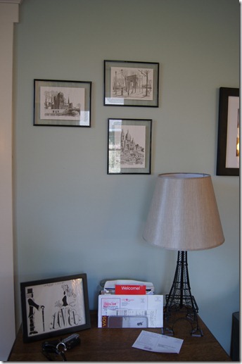
i also tweaked the wall arrangement right above the entryway table. the mr. & mrs. lower artwork was originally also hung on the wall, but it didn’t look right – maybe it was the frames, or perhaps grouping in odd numbers. i am thinking about hanging the letter L in this arrangement too, but for now it works.

DSC01133

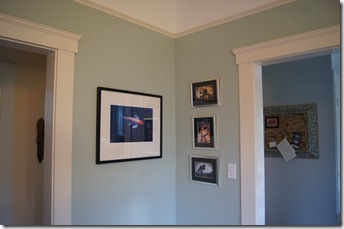
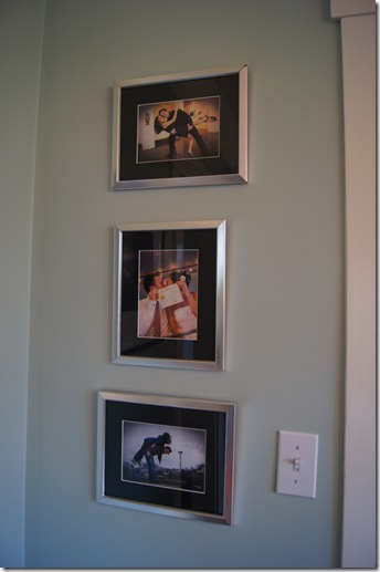
we have lots of art {you should see the stacks we have stored in the office!} & i thought this corner would be a good place to display some more pictures. the large koi used to sit on our mantle at the townhouse & the three smaller pictures are a mix of some of our favorite engagement & wedding pictures.

DSC01135

DSC01136

art & curtains up. it finally feels like we are living here!

have you hung art or curtains recently?

M
a housewarming.

our realtor PJ – if you need one, he is the best! – offered to throw us a housewarming party as a closing gift. pretty sweet, huh? PJ’s husband, justin, owns two local restaurants – the hanger in georgetown & the ridgeback café in ballard – & was brought in as our crepe expert. yep, we had fresh, delicious savory & sweet crepes hot off the crepe iron to serve our guests. and, it turns out, a lot of wine (i guess that is what happens when your host brings a case of wine & then every guest brings a bottle. we have enough wine to throw a few more parties!).

our little housewarming party took place this last saturday evening. it was great to get friends & family together & show off our house (most of the guests hadn’t seen it yet & others hadn’t seen all the updates we have done).

DSC01094

DSC01095

DSC01096

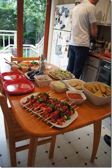
{a few appetizers to go along with the crepes.}

DSC01097

DSC01098

{me, justin, & PJ chatting about home décor & food.}

DSC01099

{our sweet neighbor antonia!}

DSC01101

DSC01107

{since we had to endure threatening skies & rain at times, we got a double rainbow!}

have you thrown any parties lately?

M
kitchen cabinet update.

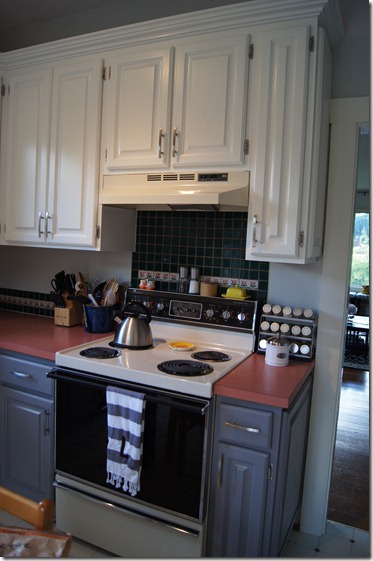
as some of you know, i recently did a bit of an overhaul to our kitchen in regards to the cabinets. the process was long & tested my patience, but we now have fresh, updated kitchen cabinets & a start to an entire update to the kitchen space.

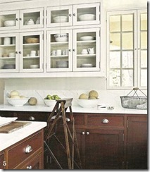
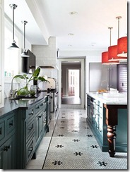
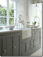
per usual, i found some pinspiration. i love the look of two-tone cabinets, don’t you? i knew this would be a great way to modernize our kitchen without totally destroying the craftsman-style feel of our house.

204210164323678752_4k8Y5fTT_c

{via}

259942209711772231_RMRIKA2V_f

{via}

279786195570665515_apTCRPrl_f

{via}

DSC00807

DSC00808

{our kitchen before we moved in.}

IMG_2041

IMG_2042

IMG_2043

IMG_2044

IMG_2045

IMG_2046

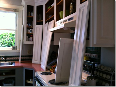
{our cabinets right before i took them down. sorry for the blurry i-Phone pictures.}

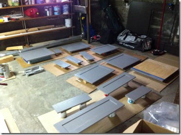
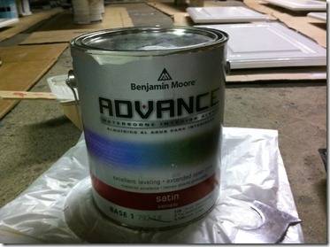
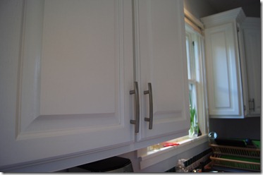
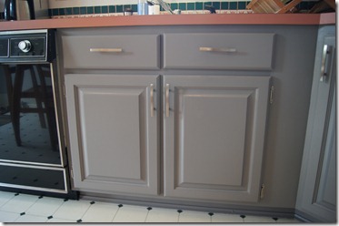
i started the update to the kitchen by doing the toughest (well, hopefully!) work first & that was priming, sanding, deglossing, & painting the kitchen cabinets {soon to follow is updating the backsplash tile & laminate countertop!}. i followed the young house love painting cabinets tutorial, which i found to be really thorough & helpful. i pretty much followed their timeline, although my project was a bit more complicated because i painted the upper & lower cabinets two different colors. i used benjamin moore cloud cover (same as YHL) on the uppers, & benjamin moore cinder on the lowers. after doing a bit of research & then chatting with aaron, we decided to pull the trigger & buy the benjamin moore advance paint (which is also what YHL used). it is a bit more expensive, & i still had to buy a primer as well (i used a valspar contractor’s bonding primer which was low-VOC), but it was money well spent. so. worth. it. the advance paint is great to work with, has no odor, & dries with an amazing finish (i chose satin). i highly, highly recommend anyone who is painting kitchen cabinets (or wood furniture?) to use benjamin moore advance paint.

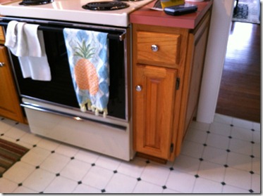
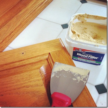
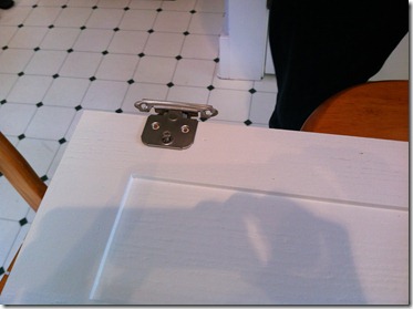
we also replaced the hinges & hardware while we were at it. originally there were knobs on the cabinets, but i could hardly couldn’t reach the knobs on the top cabinets (like above the stove) because they were placed a few inches above the bottom of the cabinet door. we figured since we would have to wood fill, sand, & drill new holes for the knobs, we might as well replace them with something we really liked, & that ended up being handles. then we figured we needed to replace the hinges to match the color of the handles. we bought our handles & hinges from myknobs.com.

i don’t feel like i need to give you a play-by-play since the YHL tutorial is so good. i will just let the pictures fill in the details. you really just wanted to see the pictures anyways, right?

IMG_2071

IMG_2081

IMG_2085

IMG_2086

IMG_2094

IMG_2095

IMG_2105

IMG_2106

IMG_2112

IMG_2149

IMG_2150

DSC01060

DSC01061

DSC01110

DSC01112

DSC01113

DSC01114

DSC01115

DSC01116

DSC01117

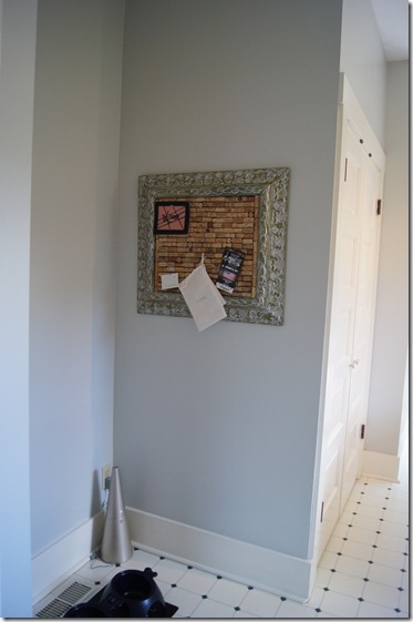
{we also hung some artwork up. this lovely corkboard was made by my mom for our wedding (the seating chart was pinned to it). we just bought an empty antique frame & my mom hot glued corks to a piece of corkboard & duck-taped/gorilla glued the board to the frame.}

DSC01119

DSC01120

the whole space has really changed just with a few coats of paint – it is awesome! we are really loving the updated cabinet colors & i am really happy we went two-tone.

next week i am going to attempt to paint the backsplash tiles (as the forest green & pink hearts really aren’t going to make the cut with the new cabinet colors). wish me luck! the following week i will attempt to paint the laminate. i am still deciding on a color, but something in the grey family.

have you painted kitchen cabinets before? would you ever want a two-toned kitchen?

M
my weekend in pictures.

IMG_2154

{stocking up for the housewarming party at TJ’s.}

IMG_2156

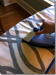
{ironing all six 109” long panels. so worth it! pics will be up on the blog soon.}

IMG_2157

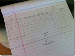
{measurements for curtain hanging.}

IMG_2159

{friday was actually warm  – not to be confused with hot! – enough to wear a maxi dress & sit on the back porch.}

IMG_2160

{shared dessert with aaron from pies & pints.}

IMG_2163

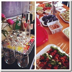
{drink & food spread for the par-tay. we also had crepes that were ah-maze-ing!}

IMG_2166

{baubles.}

IMG_2168

{this is how sadie holds my hand. interlocking forearms.}

IMG_2171

{sunday night dinner at boom noodle with my grandmother.}

IMG_2172

{we wanted to see moonrise kingdom but it was sold out. the next movie showing was that’s my boy. i knew it was going to be bad, but it was way worse than i thought it could possibly be. i had more faith in leighton meester. oh well! i think some of the upcoming summer blockbusters will make up for this one.}

we got to catch up with a few old friends & show-off our house – so fun! how was your weekend?

M

a color scheme for our living space.

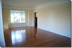
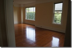
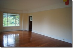
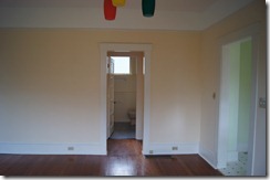
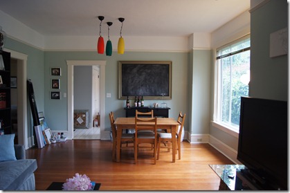
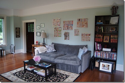
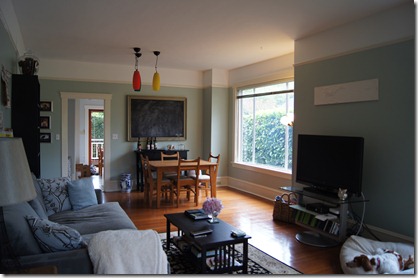
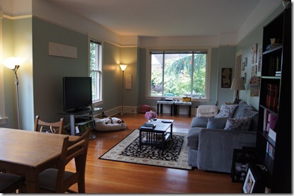
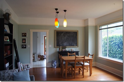
our living room & dining room combine to form a large, wonderful living space. the big picture windows on the front & side of the house are awesome & let in so much light (when there is any light!), but the yellow color was awful. i knew i wanted to update the color in this space immediately, so i waited to unpack most of this room until i could get paint on the walls. it was a lot of taping, but it was so worth it! i left the upper portion of the wall above the picture rail the original white & also left the picture rail & baseboard the original colors. we anticipated needing to re-paint the trim, but after the new color went on the wall, it was clear that the trim color was perfect the way it was, phew!

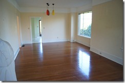
these pictures were taken before we even moved in (& are the same as the ones on the house tour page). obviously there was a huge update in just furnishing the space.

DSC00783DSC00785DSC00803DSC00813DSC00814

i wanted to add some color in this space & really, really worked at not painting it grey. aaron & i both gravitate towards grey & i know it will show up in other places in the house (yep, like in the kitchen. you will see soon enough!). i knew that if i painted this big room a not grey color, i could basically paint every other room in the house grey & it would probably be fine. our couch is grey & our coffee table & bookshelf are black, so i didn’t have much of a jumping off point since basically any color would go with our furniture. i found inspiration in two places: pinterest & young house love.

273382639850491829_Na5pe8e7_f

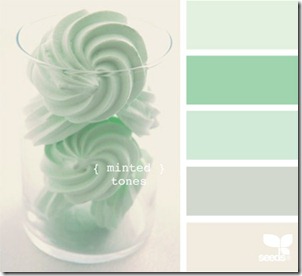
{color scheme pinspiration}

when i saw this color scheme, i fell in love instantly. it was the first & last color scheme i considered for the space. the next step was finding the perfect shade of mint green for the walls.

i looked online for colors & originally thought mint julep by benjamin moore would be a good choice. even seeing it again it looks like a great choice, but when i got a color sample home & put it up on the wall, it turned into this yellow mess. i don’t know whether it was the blue-hue in our grey couch or the existing yellow wall, but it was an immediate no.

i also picked up some other mint-y green colors from the store, along with carolina inn club aqua by valspar which is the color john & sherry of young house love painted their bedroom.

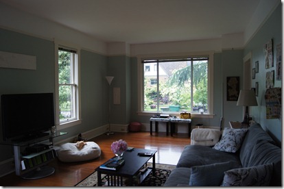
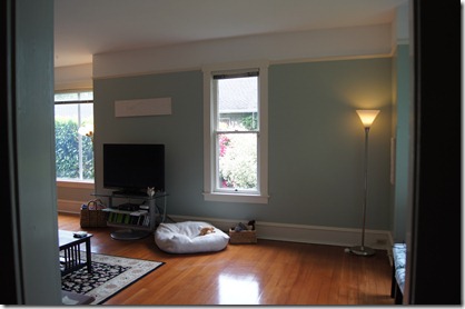
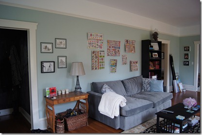
i was a little hesitant about using aqua at first, but this color (the winner!) is gorgeous! you can see in some of the pictures that we have a color trifecta going on in this room: white upper walls, ivory-ish picture rail, & aqua lower walls. {i didn’t have a ton of light when i took these pictures, so i apologize for the darkness. you do get an idea of the color though, & that is the point. i will try to update the pictures once we get a little more sun!}

DSC01063DSC01066DSC01067DSC01068DSC01069DSC01070DSC01071DSC01072

the three dining room lights are on the chopping block, but we need to get an electrician in the house in order to put the power over the actual table. right now the lights are centered in the middle of the room. lighting placement fail. so for now, we have really brightly colored dining room pendants.

also, i am not joining the show extreme couponing. i like to use paper cut-outs on the walls to help with art placement & coupons are what we had on hand since we don’t get the newspaper. i hope to get the rest of the art up in the living room this weekend!

M


source list: {if you are interested}

  • entryway table {antique from my mom & dad}
  • eiffel tower lamp & shade {target}
  • lounge couch {crate & barrel}
  • coffee table {craigslist}
  • rug {overstock}
  • diy pillows
  • (old) billy bookshelf {ikea}
  • dining table {long term loan from a friend}
  • sideboard {ikea}
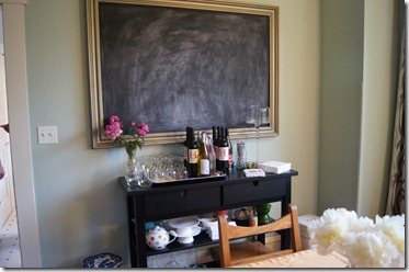
  • diy framed chalkboard
  • tv stand {unknown}
  • torchers {target}
  • white ceramic garden stool {target}
  • blue & white ceramic garden stool {vintage from my grandmother}
  • dog bed {fetch dog}
  • magazine basket with handles {pottery barn}
  • white throw blanket {pottery barn}

a test case: the entryway.

our entryway is small & dark, but takes care of the basics of housing a doormat & a few hooks for coats.

i wanted to jazz the space up a bit by adding some color on the wall, a little artwork, & a few hooks. at some point in the future we would like to add a light in this space, but there is no electrical in the room, so a light will have to wait.

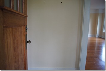
DSC00804

{this is the best & only picture of the entryway before i got my hands on it.}

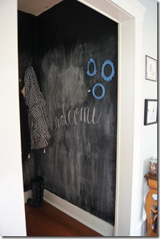
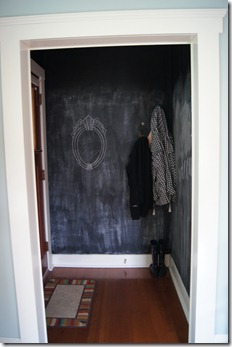
some of my inspiration came totally from my own head. i adore chalkboard paint & pretty much like to use it wherever i can. i loved the idea of having a chalkboard wall (you know, floor to ceiling) but there just didn’t seem to be a good space in our house for it. until i started brainstorming for the entryway. yep, it is covered in chalkboard paint. you may be thinking that i am crazy for wanting to paint such a small space with no light a dark color. you are right, i was probably a little crazy, but the great news is that the room really isn’t too dark, even with the nearly black walls.

the bad news {isn’t there always bad news?} is that i really didn’t consider how messy a chalkboard wall would be. i think all of that creativity got in the way of reality. so, i may eventually try to add some kind of board & batten wall treatment in order to keep that chalk dust at bay.

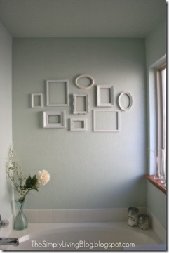
my other inspiration is actually a pinspiration.

33495590948626244_XrlsjA9U_f

{see original post here}

i love this simple, clean look of empty frames. i was able to find a few fun frames from etsy, but am still on the hunt for a few more. i also originally planned to paint the frames white like in the pinspiration photo, but i sort of liked the original frame color & decided to keep it until i added more frames. i am also sort of loving the idea of painting the frames gold.

so without further adieu, our entryway:

DSC01065

{my welcome sign in fauxligraphy & frames. that little teeny white dot next to the lower frame is actually a magnet. i painted a couple coats of magnetic primer underneath the chalkboard paint so the middle of the walls are a teeny bit magnetic.}

DSC01064

{two sets of hooks for aaron & me. i added a framed chalkboard mirror on this wall too.}

i did actually paint chalkboard paint in the entire little room, even above the doorways, to be consistent because it is unlikely we would ever write anything that high. although my friend amanda suggested that i write something way up high that is semi-permanent. i am still thinking about that. i seasoned the walls by rubbing them with the side of a jumbo piece of chalk. then i wiped the walls with a damp cloth many, many times to try to remove the excess chalk & help with the messiness. the purpose of seasoning a chalkboard is so that when you go to write or draw on it, whatever you write or draw won’t become permanent {well, permanent in that you will always be able to see it even after it is erased}. i am torn about the seasoning of the walls; i am glad i did so that we can erase things, but i am sad i did because (a) seasoning with the chalk is what is making the walls so messy, & (b) i wasn’t tall enough (& was too lazy to get a ladder or chair) so the seasoning only goes up about 5.5 feet. oh well.

i would like to find a fun, colorful, & durable rug for this space, but for now, our old front doormat works. any ideas on where to get a good doormat?

would you paint any of your walls with chalkboard paint, or is it just me?

M


source list: