project baby #2 {nursery moodboard}

I know I have mentioned a nursery design for Baby Foot, and since I have already accumulated most of the pieces for it, I thought I would share! The loose theme for this new nursery is travel or maps and globes which lends itself nicely to keeping things gender neutral.

If I haven’t mentioned it before, the plan is to leave the nursery next to our room and to move Eloise down one room to what is currently our office. This way the nursery is still right next door to our room (and I don’t need a monitor except for upstairs) and Eloise gets a brand-new big kid room!

Almost all of the furniture is the same from Eloise’s nursery to this new nursery. It just didn’t make sense to replace it all since it all worked so well.

artboard-1


{1} glider – the same Land of Nod Milo Glider which we are still in LOVE with. it is super comfy and I know that we will spend so many more hours nursing, cuddling, and reading in this chair!

{2) curtains – these metallic grey curtains should work well as a neutral against the striped ceiling and a tiny pop of color against the white walls. I may still need to add a blackout liner though.

{3} footstool – this faux fur one which is really different than the floor pouf I had for Eloise but a good height to put our feet up (so important in a nursery!).

{4} crib – this is E’s old crib and the Hudson by Babyletto and we really liked it. I may add a crib skirt if I have time since I think it would look better when the mattress is raised up.

{5} hand-painted globe – this is a project that is on my to-do list. I am trying to decide whether to keep the continents and paint their names, or paint the entire globe and add a quote.

{6} table – this scallop one from Pillowfort is so whimsical and I love it! Even E exclaimed that it looked like a birthday cake the other day. I know I need a table for a lamp, a clock, my phone, and about a zillion other things. Plus, it will be great for a future playroom.

{7} picture ledge bookshelves – keeping these from Eloise’s room. These are the old IKEA picture ledges (which I love!) and worked well for keeping books on the wall for before naptime or bedtime, but not so many books that it was overwhelming.

{8} rug – this Rags to Riches one from Land of Nod. I had another rug in mind, but as soon as I saw this one (and felt it – it’s so soft!) I knew it was the one! It is tricky to find such a large rug (8 by 10) that is affordable (I splurged on E’s) and kid-appropriate. This one will be great for the nursery for tummy time and lots of floor time for E.

{9} mid-century dresser – keeping the same one from E’s nursery since it worked so well as a changing table! There was so much drawer space which came in handy for when we started cloth diapering, and also when the baby’s clothes are way too little to hang!

{10} bean bag chair (not pictured) – I am thinking of making Eloise a chair (like this) for the nursery since I know she will be spending a lot of time in there with me and Baby Foot. She does well playing quietly and reading to herself and I hope this continues! Plus, how cute is this maps print fabric by Rifle Paper Co?!

{11} mobile (not pictured) – this is the part of the nursery that has me the most stumped, mostly because I don’t like any mobiles… I have considered this one but am also thinking of making one with tiny globes. Stay tuned.

And for Eloise’s room, we are planning on moving a lot of décor from her nursery over to her new room, but here’s a bit more detail:

  • this West Elm Safari rug, these baby animal prints, this colorblock lamp (seen here), this elephant laundry hamper and white curtains (with red pom poms added) will move with her
  • this wood bead chandelier from Pottery Barn Kids will be a new addition
  • I am thinking of painting the walls this purple-grey color (London Fog by Benjamin Moore) since E has requested purple walls (though I still need to test it!). I swear it looks more purple in real life; we tested it in our entryway and nixed it because it was so purple!
  • two picture ledges will be hung low for books with room for a gallery wall above
  • a low-boy mid-century dresser that I still need to find!
  • a few empty picture frames to showcase all of E’s artwork from school (like this)
  • a big kid bed (a twin) which we have the head and foot board for but Aaron still needs to build out the frame
  • a hand-made quilt and pillow sham (here’s my inspiration)
  • and I am thinking about reupholstering a chair that we inherited from my grandmother that is currently in our living room, but E loves and I thought it would be fun to put it in her new room (since the glider will stay in the nursery). Even though I have reupholstered, this chair is WAY beyond my skill level, and since there is so much sentimental value with it, there is no way I would take it on. So I am waiting for Calico Corners to have an awesome sale…

It is crazy to think that in a few short months we will have two kids in two rooms, but I know it is right around the corner. I am stashing all of the things for the two new rooms in our old office and at some point in the near future (probably while Aaron is home for Christmas/New Year’s from work) we will start to transition the rooms and then pick a date to move Eloise (maybe early February).

Any mamas out there designing nurseries or big kid rooms? I’d love to hear what you are thinking for the design!

M

This post contains affiliate links.

apartment therapy feature {upholstered wingback chair}

{via Apartment Therapy}

I have been so flattered by everyone’s sweet comments about my upholstered chair project! it was such a long-spanning project & I was thrilled to be able to finally share it with you (especially to those of you who had seen it before or in progress).

I am also really excited to share that Apartment Therapy picked up the project for its Before & After series. if you haven’t been reading Apartment Therapy before, you should head over there & take a look! it is an amazing collection of house tours, projects, & beautiful things. it is a huge honor to have the project shared in that space. go check out the chair if you haven’t already!

thanks Apartment Therapy!

M

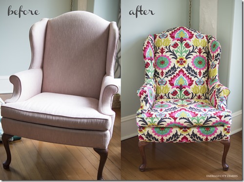
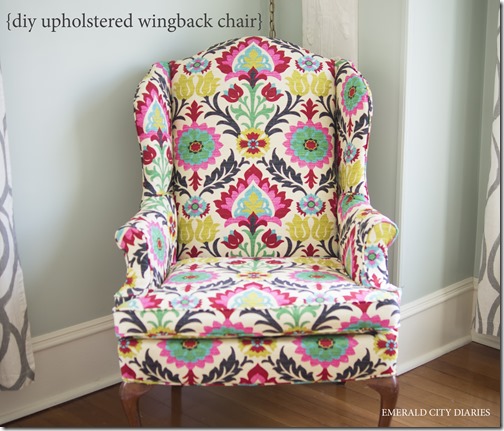
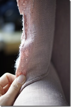
diy upholstered wingback chair.

SONY DSC

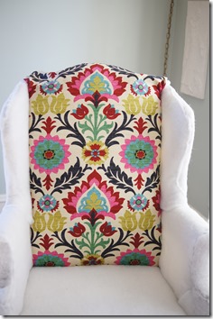
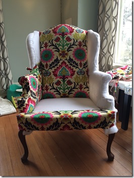
seriously, SWOON! I have a new favorite piece of furniture!

this project has been a long-time in the making so the fact that it is finally done is sort of a miracle. I have been interested in reupholstery for a while & completed smaller projects (upholstered lack tables HERE & our old headboard) but have been waiting to do a much bigger project.

I found this wingback chair on Craigslist almost three years ago (right after we bought our house). it was listed for $5 so we went to take a look & it was in such good shape. we gave the sellers $10 for the chair & delivery – such a good deal! then the chair sat in our basement. & it sat & sat. I finally decided on a fabric & bought it, & then had buyer’s remorse & bought another fabric. it moved with the other things into storage last spring to make way for the house renovation & then came back & sat in our living room. finally in january while aaron was on paternity leave I decided it was do or die. I had to at least start to reupholster it or I knew I never would. & three months worth of naptimes later it is finally complete!

I found lots of tutorials on Pinterest but the main ones I used are listed below:

  • Basic Chair Reupholster Instruction: here & here
  • Cording Tutorial: here
  • Ply-Grip (Curve Ease) Tutorial: here

reupholstering is a pretty meticulous process, though you can almost always go back & do something over again if it doesn’t work out right the first time (you just have to be willing to pull out all of the staples again!). I was surprised how quickly the chair came back together since taking it apart took forever.

supplies:

  • chair
  • upholstery fabric – I used 6ish yards of this fabric
  • staple gun & staples – we have one that attaches to our air compressor & I highly recommend that for ease of use (though it is loud to run)
  • sewing machine & a zipper foot (to sew cording)
  • good (fabric) scissors
  • upholstery thread to match fabric – I used Coats & Clarke
  • seam ripper
  • piping/cording (if you don’t reuse the original)
  • zipper for cushion cover (optional – you could either reuse the zipper like I did or cover the cushion without a zipper)
  • tack remover
  • rubber mallet – I didn’t have one of these & I wish I would have (you can also use a hammer & towel)
  • needle-nose pliers
  • cardboard upholstery tack strip
  • upholstery tack nail strip
  • Ply-Grip (Curve Ease)
  • quilt batting
  • upholstery dust cover (optional – I reused the original)
  • camera – for taking lots of pictures as you take the chair apart!

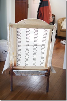
after finding your chair & choosing your fabric, the first part of reupholstering is to un-upholster your chair. this is really time intensive as there are likely 7 million staples, plus you want to document as much as you can since you will want to put the new fabric & pieces on the exact way they came off. I took pictures as I removed pieces (hundreds of pictures which I will spare you!) but in hindsight & for a few particular places I wish I would have set up a tri-pod & videotaped those sections. just something to think about. also, as I removed pieces of fabric, I annotated on the front with a Sharpie about how it went on – like whether there was a tack strip on one side, or piping, or whatever.

_DSC5683_DSC5688

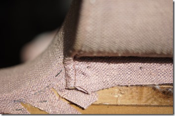
{the arm rest & the wing.}

_DSC5869

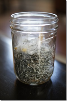
{I used a jar to contain all of the old staples. that’s a lot of staples!}

once your chair is completely stripped, you will want to check the structure for any damage. unfortunately, you may get to this point & figure out your chair isn’t worth reupholstering… that would be a bummer. hopefully you find that the structure is in good shape as well as the bottom springs, etc.

_DSC5858_DSC5860

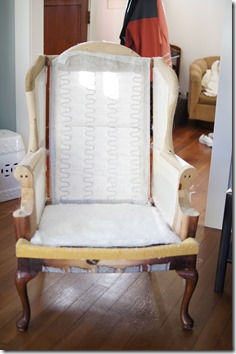
{the front & back of the chair.}

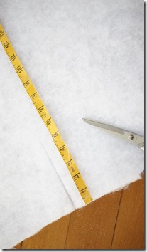
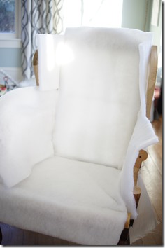
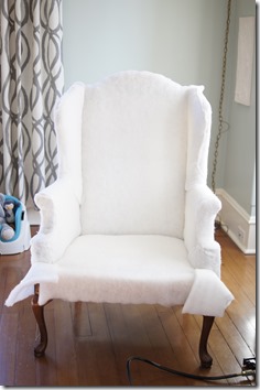
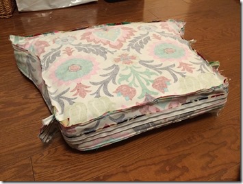
next you’ll want to cover your chair in at least one layer of batting (I did two on the wings & sides). you can also do a layer of foam underneath the batting. I didn’t because there wasn’t any originally, except for on the back upper cushion which I reused since it was in great shape. the nice thing about reupholstering, starting with batting, is that you don’t have to cut pieces exactly right. as long as there is enough material to cover the section, you can cut away any extra as you are stapling. & if you didn’t cut enough material to begin with, you can always add without there being weird seams since it will all be covered with fabric anyways.

_DSC5862_DSC5863

{cutting the batting & attaching it to the chair.}

_DSC5870

{stapling all of the batting in place.}

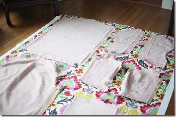
then you will want to lay out all of your pieces onto your new fabric & use them as patterns. if anything, you will want to cut things big because you can always trim them down. also make a note of extra cuts or jagged edges on the original pieces – these places are where the fabric had to be cut in order to fit into or around part of the chair structure & you’ll want to duplicate them as best you can. also, if you have a pattern like the one I used where you want specific parts of the fabric to be on specific parts of the chair, you’ll want to cut all of your big pieces first (lay them all out to make sure you have enough fabric) & then use the extra fabric for smaller pieces where the pattern doesn’t matter as much. for me, the front & back pieces, the front & back of the cushion cover, & the very front bottom edge of the chair where important for me to have the same floral piece centered; so I cut all of those pieces first.

_DSC5701

{strategizing with the fabric.}

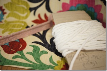
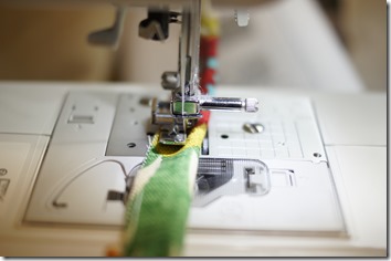
I sewed all of my piping before I really started putting the chair back together. I needed different pieces of piping along the way & I figured it would be nice to have it all done from the beginning & not have to stop & sew some together if I needed it for a certain section. I used the tutorial linked above. as long as you have a zipper foot for your machine, you are pretty much good to go. I decided against making bias strips since there weren’t a lot of curves in my chair pieces where piping would have gone. for the chair cushion I was going to do bias strips, but the original cushion didn’t have separate pieces of piping (it was part of the front & back seat fabric) so I just followed the original design. 

_DSC5864

{supplies for piping.}

_DSC5865

{sewing piping with the zipper foot.}

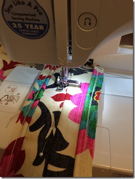
I also sewed the cushion cover at the same time I did the piping since I was into the sewing groove & needed to do piping for the cover anyways. I was able to re-use the zipper & the cushion which was helpful. down the line I may replace the cushion, but for now it works.

20150311_234241203_iOS20150317_032237872_iOS

{sewing in the zipper & pinning the cushion pieces.}

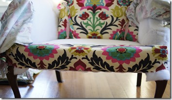
when it came to attaching the fabric to the frame of the chair, I started with the front part of the chair. it was one of the largest pieces, but also one of the easiest to put on. from there I moved down to the bottom front edge of the chair where there was a piece that had to be sewn together (one piece was printed & wraps around the front edge, & the other piece was plain cotton muslin & ran under the cushion). I then moved to the arms of the chair. the two pieces that covered the arms had sewn pieces (the front oval shapes on the arm rests) in order to more easily attach the piping around that section I assume. because it was sewn together originally, I did the same thing when it came to reattaching. up next were the inside wings, & then the outside wings. after I did the bottom sides of the chair. the last big fabric piece was the back. lastly I did the piping that ran along the entire bottom edge, & finally the bottom dust cover (which I was able to reuse the original).

_DSC587220150319_224940515_iOS

{adding the back & side pieces.}

_DSC5907

{attaching the bottom piece.}

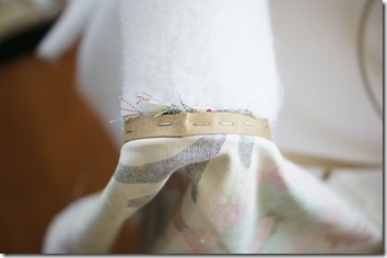
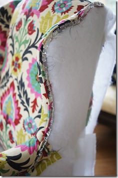
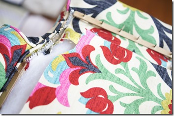
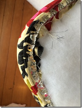
there are a few places that I used extra upholstery pieces to help get clean lines or edges using materials listed above. I used the cardboard tack strip (essentially a skinny piece of flexible cardstock) along the top curve of the arm rest, along the top of the piping on the inside of the chair wings, & in the top few inches of the chair back. I used the Ply-Grip (after watching the video) along the outsides of the wings, directly underneath the bottoms of the arm rests, & along the back curve of the top of the chair. & I used the tack nail strip along the top & sides of the bottom outside pieces, & along the outsides of the big back piece.

_DSC5910

{cardboard tack strip on top of arm.}

_DSC5985

{Ply-Grip on outside wing.}

_DSC5986

{Ply-Grip & nail tack strip on outside bottom.}

20150319_232623391_iOS

{Ply-Grip along the back curve.}

a lot of reupholstering is just mimicking how the pieces were originally attached, so photos or video of the original chair & it’s disassembly are the most valuable in a project like this. you just have to go for it! I had to break my work over three months worth of naptimes & a few chunks of time on the weekend because of the nail gun. I could run the air compressor during eloise’s naptime & luckily the compressor doesn’t have to run the entire time you use the staple gun.

this is one of my favorite DIYs yet & now I want to reupholster everything we have in this gorgeous fabric!

SONY DSC

have you reupholstered anything recently? I’d love to see!

M

this post contains affiliate links.
friday I’m in love.

this will be a new series where I will write about things we are loving each week, whether it be a product we’re using, a recipe we’re eating, or something we’re doing. some weeks will be more exciting than others but this is a chance for me to share a little more about the small things happening and a chance to write more freely about whatever topic I choose. I hope you enjoy it! I am excited to see how it evolves over time. I am also excited that Kendra will be sharing the same each week, so make sure you pop over to her blog too to see what she’s up to. we would also love for you to join us! leave a comment and we’ll come check out what you’re loving each week!

{one} the sjp collection at nordstrom.

Actress Sarah Jessica Parker presents her new shoe collection.

have you heard about this? I have been anticipating it since it was first announced this past summer & can hardly contain my excitement! I am a HUGE sjp fan, both as carrie bradshaw and as herself. {its really great to see such a chic gal who isn’t as tall as a super model!} plus, nordstrom? I can’t think of a better collab. seattle might not be the trendiest of cities, but it does boast the flagship nordy’s. the collection is set to launch of february 28th & I bet you can guess what will be on my birthday wishlist this year!
{two} caramelized butternut squash, crispy kale, & fontina pizza.
Caramelized Butternut, Crispy Kale + Fontina Pizza | halfbakedharvest.com

aaron has been making pizza for years, even making his own dough & pesto for a while there! we both like pesto-based pizzas {rather than traditional red sauce} but are pretty open to a wide variety of toppings. I am always interested when I see a new pizza recipe, & this one is no exception. butternut squash, kale, & pomegranate seeds on a pizza? count us in. we are planning on making {& enjoying} it this weekend!
{three} sadie had surgery last week {mentioned here} to have a growth removed. it grew so fast that we {okay, just me!} were worried. aaron got a call from the vet today & the growth was benign. yay! feeling very lucky that our sweet dog has a clean bill of health!

{four} beats by dre x beats pill “happy.”

[youtube=http://www.youtube.com/watch?v=FH1FCBmcNGg&w=448&h=252&hd=1]

uh, yes. this is a commercial. the first time I heard this song, I was hooked! plus, I sorta love those speakers dancing around…

{five} target threshold tufted bench.Threshold™ Tufted Bench - Buff Beige and Gold

I saw this bench from target’s new threshold collection & I am so in love! it’s a great looking piece for a great price {$99!}. it would be great at the end of a bed, or in a small entryway. now, where could I find a place for it…

what are you loving this week?

M

highlights of 2013.

2013 2014

{via}

happy 2014!

i’ve said it before, & i’ll say it again!, yearly recaps are always my favorite kinds of blog posts. its a small way to sum up your year & to see how much the last 365 days have brought. as i look forward to the New Year, i am humbled & grateful by all of the wondrous events of 2013. here’s the rundown of ours:

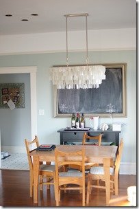
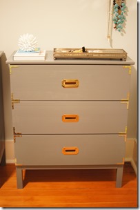
january: I started out the new year with a bout of the flu. we hosted our first blog giveaway! we installed the west elm hanging capiz chandelier over our dining room table. I framed my diy polaroids for our bedroom walls. amanda & I met john & sherry from young house love during their book signing tour! I diy-ed campaign dressers for our bedroom.

DSC02562

IMG_3140

DSC02640

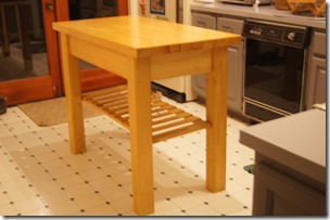
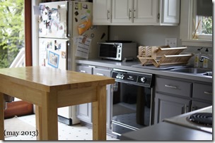
february: I did lots of diy-ing for valentine’s day {here, here, & here} I celebrated my birthday! we bought a kitchen island. I tried to be better about getting in front of the camera!

DSC02663

DSC02679

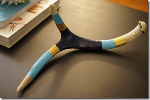
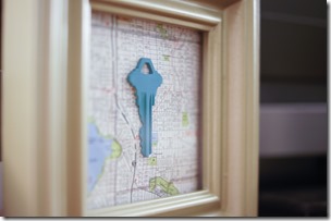
march: I tried my hand at painting an antler {& was so impressed with the results!}. we took my 91-year-old grandmother to target for the first time! amanda & I diy-ed framed house keys on maps. we sold jez the jetta & bought a new car.

_DSC2697

SONY DSC

jez

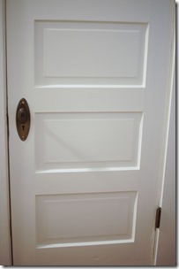
april: we updated our bathroom vanity with a converted antique sideboard. we updated the closet doors by stripping off the old paint in a crock pot. we celebrated our one year anniversary in our house & I reviewed all of the house diys!

_DSC2727

SONY DSC

SONY DSC

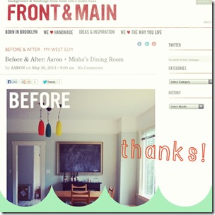
may: we finally got some good weather in seattle! I painted the ceiling & hallway walls. we celebrated aaron’s thirtieth birthday with a beer tasting party! we had a fun-filled memorial day weekend. we were featured in west elm’s blog front & main.

_DSC2821

_DSC2849

_DSC2851

front and main

june: aaron replaced our toilet. sadie was featured in the seattle dog spot blog. my parents visited for a long weekend en route to the olympic peninsula. my diy his & hers maps were featured. we finally got some summer weather!

_DSC2935

seattle dog blog thank you

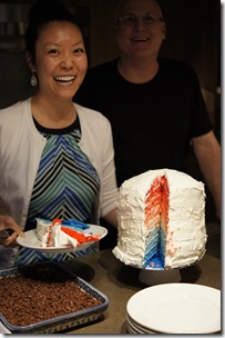
july: we celebrated the long Fourth of July weekend with a holiday parade, fireworks, & time with friends. I made a nine layer ombre cake! we replaced our kitchen track lights with globe pendants from west elm. we road-tripped to idaho for my ten-year high school reunion. we started growing our first eggplant.

IMG_3657

_DSC2993

august: we celebrated our three year wedding anniversary. the blog got a Liebster Award Nomination. I diy-ed the tiniest baby hats for our friends’ new baby. we road-tripped to hood river, oregon to celebrate my cousin’s wedding.

MISAAR_1915

SONY DSC

_DSC3164

_DSC3233

september: we went to the husky vs. bronco game to kick-off labor day weekend complete with husky-style tailgating {via boat}. we took advantage of the warm weather & cleaned up the front yard with a fun game called love it or lose it. we celebrated sadie’s ninth birthday! I attended the Alt Summit for Everyone blog conference.

IMG_3907

_DSC3250

october: I attempted to start doing fashion posts again. we celebrated our two year blog anniversary at emerald city diaries! I finished up with the #embracethecamera challenge. we went to the pumpkin patch & carved pumpkins with friends.

_DSC3248

_DSC32761380499_10201673674635081_818032991_n

november: aaron joined a team for movember 2013. we snuck off to hawaii for thanksgiving.

_DSC3386

IMG_4198_DSC3536IMG_4296_DSC3624

december: I reviewed some of my favorite weekend in pictures pics. I participated in A Pinterest Christmas for the third year {see this year’s projects here, here, here, here, & here}! we celebrated Christmas in indiana with aaron’s family.

_DSC3398_DSC3412_DSC3440

reflecting back on this year, i am reminded how blessed we are & also how different this year has been than the year previous. it has been such a wonderful year & ringing in a new one is a bit bittersweet.

how was your 2013 – was it a year to remember, or are you itching to start 2014 already?

M

see past yearly highlights for 2011 & 2012.

a year in review {house diys}.

it is hard to believe but we have been in our house for a year – can you believe it? while it doesn’t seem like yesterday that we were moving & packing & unpacking, it definitely doesn’t feel like its been an entire year. {where does the time go?}

i thought since so much of this blog is devoted to the work we have put into the house, it would be fun to do a review of all of our house projects over the last year. {also, this is making up for the fact that i have been horrible about keeping the house tour tab up-to-date.}

here we go! {are you ready for lots of pictures?}

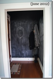
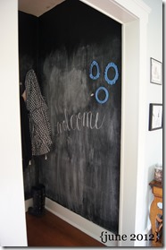
{entryway} – chalkboard paint

SONY DSC

SONY DSCSONY DSC

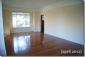
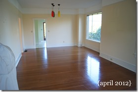
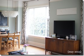
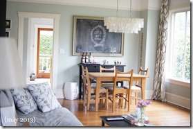
{living room & dining room} – paint color, curtains, west elm light

SONY DSCSONY DSCSONY DSCSONY DSCSONY DSCSONY DSCSONY DSCSONY DSC

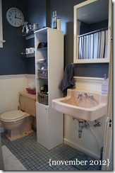
{bathroom} – paint color, Ikea light, vanity

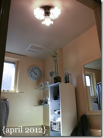
SONY DSCSONY DSCbathroom light april 2012

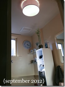
bathroom light september 2012SONY DSCSONY DSCSONY DSC

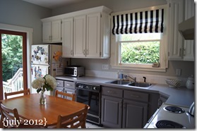
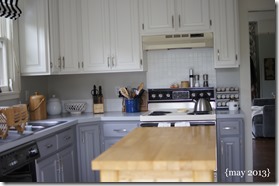
{kitchen} – paint color (walls), painted cabinets, painted countertops, painted tile, kitchen island, roman curtain

SONY DSCSONY DSCSONY DSCSONY DSCSONY DSCSONY DSCSONY DSCSONY DSCSONY DSCSONY DSC

{office}

SONY DSCSONY DSC

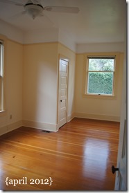
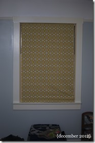
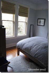
{bedroom} – paint color, roman curtains, closet doors

SONY DSCSONY DSCSONY DSCSONY DSCSONY DSC

phew! it is hard to believe we did all of that in just one year. we still have lots of things on the to do list, including some bigger projects that we are saving up for! reviewing all of these projects makes me thankful that we have such a fun house to work on & enjoy. it was scary to make the decision to buy a house last year {it felt so grown-up!} but we have loved every minute of it & learned so much.

what sorts of projects have you completed in your living space? do you ever go back & review all of your hard work?

M

old turned new {an update to our bathroom vanity}.

to start out, i want to give a HUGE shout-out to aaron, my dad, & our friend rhett for making this project work. it wouldn’t have come together so well without all of them, so thank you, thank you, thank you!

as most of you know, we have been itching to get a vanity of some kind into our bathroom since day one. the sink hanging from the wall was just not cutting it as it gave us approximately 2 inches of “counter space” on either side of the sink. given the age of our house, it felt wrong to just buy a brand-new vanity so we i decided we should find an antique piece to convert.

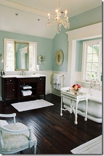
pinspiration bathroom

{my favorite bathroom pin via pinterest}

it took a few weeks to scour craigslist in search of the perfect antique piece. at first i searched for dressers, but then switched to sideboards when i decided i would rather have doors than drawers for storage. we were obviously limited in the space we had which was a bit of a challenge when searching for a sideboard, but i also wanted a good wood color as i planned on leaving the wood {& not painting}.

this isn’t really a diy post {even though it was diy’d} as the project was done based specifically on this antique piece & there wasn’t step-by-step photography taken. however, i can give you the general idea of what was done.

supplies:

  • antique hutch/sideboard/dresser – we found ours on craigslist
  • countertop with undermount sink {or sink to mount on top} – we found ours at lowe’s* {i can’t find it online, but the brand was allen+roth}
  • faucet – we found ours on overstock.com {it looks identical to this one from pottery barn}
  • wood glue, drill, scrap wood pieces, plumbing {p-trap, etc.}

*when we went shopping for countertops to fit over our 19 w x 47 l x 36 h sideboard we immediately assumed that in order to get a top that would have a one inch overhang on all three sides, we would have to custom order something. so we spent a lot of time with the good folks at both home depot & lowe’s pricing out different options for a countertop in everything from marble to granite to hi-mac {which is LG’s new composite product}. we were ready to pull the trigger & spend $700 on a custom white quartz countertop from lowe’s. we went over to price out/buy an undermount sink when we discovered a pre-made quartz countertop with an undermount sink that was one inch bigger than what we were looking for. it wasn’t pure white, but it was only $230! one guess on which one we chose…

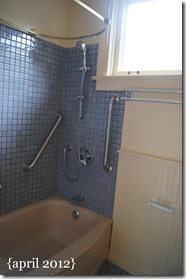
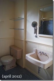
before i get into pictures of the process, let’s take a look at the bathroom when we first bought the house.

DSC00816DSC00817

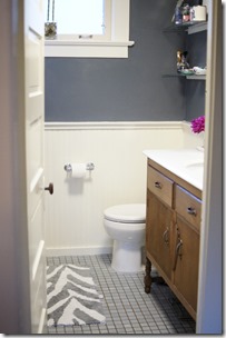
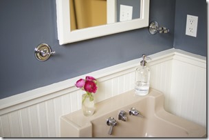
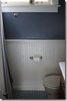
a few months later, we added a few updates as seen here. the light fixture update here. and then we did the paint update on the bead board & walls.

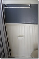
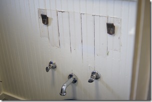
we also did a fixture update, so here are the original fixtures in the bathroom. none of them were really awful but we didn’t really like any of them & took the opportunity to give them an update as well.

_DSC2708_DSC2709

{double towel bar & tp holder // hand towel hooks & glass holder}

aaron started by un-attaching the plumbing & taking the sink off the wall {it was mounted by two all brackets}. then aaron & my dad moved the sideboard up into the space. originally we all thought there would need to be a hole cut to accommodate the undermount sink, but they found out that the top piece was easily removed.

next they placed the countertop onto to sideboard to determine how best to anchor the countertop to the sideboard & the sideboard to the wall, as well as how to stabilize the sideboard in the back.

_DSC2710_DSC2711

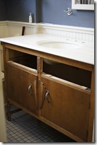
once the sideboard & countertop were completed {which took an entire weekend!} it was time to re-work the front drawers to accommodate the undermount sink. aaron & my dad took apart one-half of the drawer & rebuilt the inside edge to basically go around the sink. we ended up losing only one-third of the drawer space! {sidenote: we don’t have pictures of the drawers & will update soon!}

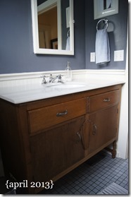
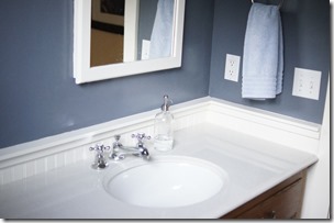
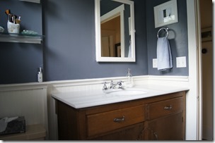
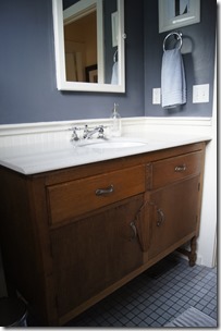
& the reveal of our new bathroom vanity! the other bathroom fixtures {tp holder, towel hooks, hand towel ring} are all from the pottery barn mercer collection.

_DSC2723_DSC2724_DSC2728_DSC2727

isn’t it lovely? i am still amazed that they were able to take the basic idea of converting an antique piece & coming up with this!

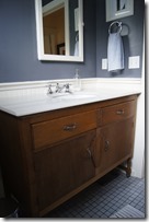
it is big, well huge considering what we started with, & for some may seem too big. it is also tall standing at 37 inches. {we could have done shorter by chopping off the legs, but we wanted to be able to clean under the piece, & perhaps add storage baskets. also, my mom & dad’s house has tall counters in all of the bathrooms so that is what i grew up with.} despite the large contrast in size from before to after, we are really happy with the piece, the counterspace, & the storage. it is exactly what we wanted.

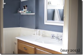
we are loving the color of the piece & are so glad we didn’t/don’t have to paint it. the richness of the wood is great in contrast to the bright white of the counter & bead board as well as the dark wall color – don’t you think? it just needs a little oil, some storage organizers underneath & we are good to go. {sidenote: we plan on also updating the toilet & bath to be white, but are still saving up! also we plan on taking out the old medicine cabinet & replacing it with a big mirror. we are undecided on the glass shelves.}

what do you think about converting antiques into bathroom vanities {or kitchen islands or entertainment centers}?

M

we bought an island {kitchen update}.

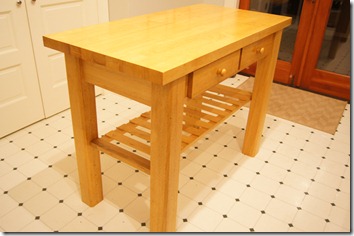
our kitchen has an “L” shaped{ish} counter so when we moved in last spring with two kitchen tables, one went in the dining room & one went in the kitchen. it was nice to have two big surfaces in the house as one typically acted as our eating area while the other acted as a crafting/project space. but, it did seem weird to have two kitchen tables in our small, little house, so we i have been on the hunt for a kitchen island for the past few months.

DSC01417

{the kitchen right after it was updated.}

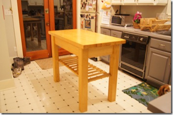
i was randomly searching on craigslist a few weeks ago when i found a simple kitchen island that seemed to fit our my wishlist: butcher block top, counter height, and allows for stools. we called the seller to ask if it was still available & we were confident enough in it to borrow a friend’s truck {thanks colin!} & drive almost an hour north to look at it.

well, needless to say we ended up buying it & hauling it home. once aaron tightened up the legs, it was ready to go! we are really happy with the piece & while it is not perfect {yet} it is really nice to have extra counter space.

DSC02680DSC02681

we are content with the island for now, but do have plans to remove the shelf {it is right at sadie-height so not much can be stored there}, sand the glossy finish off the top, paint the legs, & add stools. it shouldn’t be too big of a project after tackling all of the kitchen cabinets last spring, but i think we will wait until it is warm enough to just move it out to the deck to do the work – rather than move it down to the basement – so basically anytime after july 4th! {for those of you not familiar with the quirky seattle weather, we basically don’t get summer weather – read: hot – until after the 4th of july.}

do you have an island or an eating area in your kitchen or both?

M

diy campaign dressers.

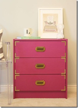
it probably isn’t a surprise that when aaron asked me what i wanted for christmas that i asked for supplies for a diy project. seems like diys & stuff for the house tops the wish list these days. while there are a few lots of things that i am eyeing or wanting to do for the house, i decided that i needed to upgrade my dresser.

if you don’t recall, this was my dresser.

DSC02289

there wasn’t anything particularly wrong with it & it functioned well. however, i don’t find it very aesthetically pleasing & it was way too tall for me {i had to jump to see my jewelry!}. so, when deciding what i wanted to replace the dresser, i focused on maintaining functionality & height {or lack thereof}.

naturally, i found a diy on pinterest a few months back that immediately caught my attention.

DIY Campaign Dresser

{original pinterest link – DIY: Campaign Chest}

i basically followed this tutorial, but changed the dresser base & the handles {more about that in a bit}.

supplies {for one dresser}:

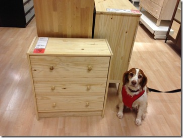
{sidenote: when we went to ikea to buy the dressers for this project, i was sure we were going to buy the rast dresser that was used in the tutorial. however, when we got to the dresser section of the store, we realized that the rast dresser is tiny {see how it compares to sadie} & could be used as maybe a nightstand or kid’s dresser. so, on the spot we had to punt & decided that the tarva dresser, which was also raw pine wood, would be a good alternative. it didn’t have quite the same lines as a “traditional” campaign dresser would with its top & legs, but we just went with it.}

photo

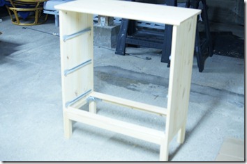
i started by assembling the dresser & priming it.

DSC02546

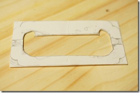
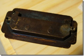
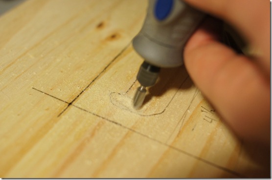
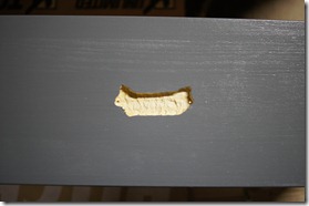
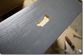
i assembled the drawers. then aaron sketched out the back of the drawer hinge & hand-routed the drawer fronts {thank you husband!} so that the drawer pulls would lie flat. {sidenote: the tutorial uses campaign-style handles that lie flat against the drawer without routing. i couldn’t find these anywhere!}

DSC02555DSC02554DSC02553

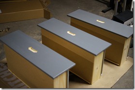
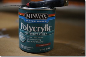
i primed the drawer fronts & their edges, & then painted the dresser & drawers. i ended up painting three coats {mostly with roller but brush where the roller wouldn’t fit}. i really wanted these to be high, high gloss, but since i wasn’t willing to use oil-based paint i didn’t get the high, high gloss. we decided that since these dressers would get so much use & also to help boost the glossiness we should put on a coat of polycrylic. we were able to get a polycrylic {see the link above} in a gloss that was pretty low VOC. i followed the instructions & put on three thin coats.

DSC02622DSC02623DSC02624DSC02625

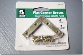
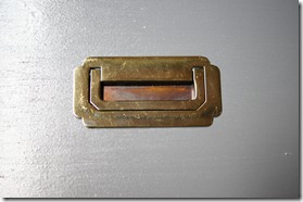
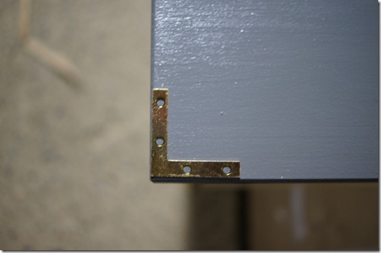
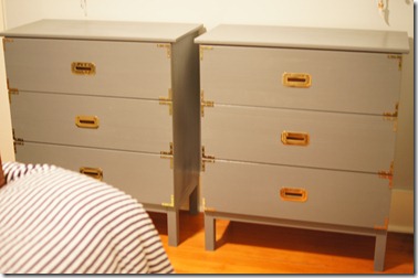
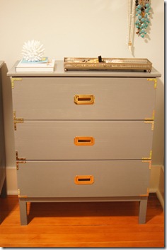
after drying for just over 24 hours, we attached the hardware. this was a lot of work, but so worth it to see ikea dressers turn into pseudo-campaign dressers.

DSC02626DSC02627DSC02629

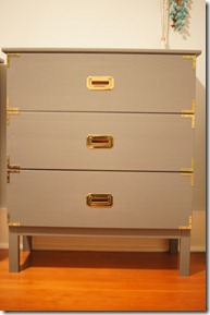
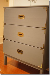
after the brass corners were placed & the handles were set, we were able to move them to their new home! {sidenote: there is a pretty big difference in color between the pictures above & the pictures below. i tried my best with my very limited knowledge of how to use the camera’s ISO & f-stop, but the grey color in the pictures above are the best representation of the color of the dressers.}

DSC02635

DSC02636DSC02637

DSC02640

while these are pretty non-traditional looking campaign dressers, i am really happy with the result. now i just need to find the right mirror/art/jewelry hanging combination for the wall above the dressers – any suggestions?

what are you storing your clothes in – dresser, armoire, closet?

M