a shower for baby garner-ballard.

one of the reasons we picked the weekend before last to take a trip to the midwest was so that i could attend meg’s baby shower. {sidenote: meg is a cousin of one of aaron’s cousins, but that is just semantics & i consider meg family!}

one of the really fun parts about the shower is that kendra & i kept our trip on the DL, & showed up as surprise guests for meg. so fun!

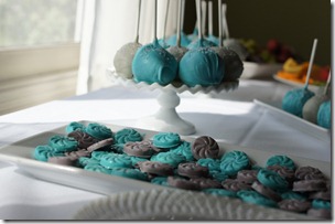
aaron’s aunt & cousins – sharon, abbi, & maggi – threw the shower & they did such a wonderful job. the décor was so adorable & i was loving the color scheme. meg knows that she is having a boy, but i love that the shower didn’t scream “BOY!”

DSC01565DSC01566

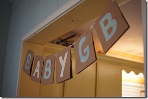
{those cake pops were delish // a fun sign for baby GB}

DSC01567

DSC01568

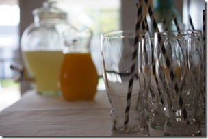
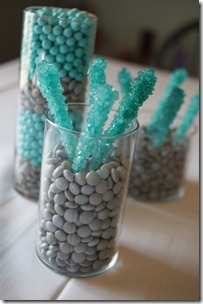
{stripey straws for the drinks // fun colored candy}

DSC01569DSC01570

{maggi, meg, kendra, & kenley // mama & daughter}

DSC01574

{meg was spoiled with lots of love in the form of presents!}

DSC01576DSC01578

{meg opening presents with her sister kait by her side // kenley wanted in on the present-opening action}

DSC01582DSC01588

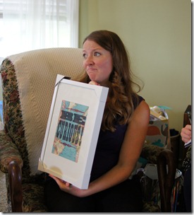
{meg enjoying a handmade card // i made some art of meg’s nursery}

DSC01590

{love you meg & happy shower!}

where is the farthest you have flown for a baby shower?

M

p.s. maggi, abbi, meg, & kendra all have blogs, so if you aren’t already a reader, you should definitely check them out!

pinspiration: hanging jewelry storage.

here is another project that has been done for some time, but i have been delinquent about posting…

when we moved in – which was ten weeks ago! – i didn’t unpack my jewelry right away. in fact, it sat in the bags & boxes i had packed it in for weeks. weeks! i have a pretty good sized jewelry box that holds earrings (that is basically all that is in it), but nothing to hold bracelets, bangles, necklaces, etc. i knew i didn’t want to unpack & have it be a mess, so i waited.

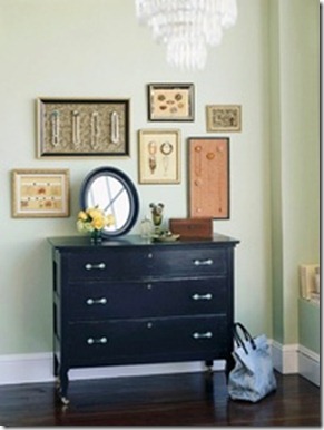
then i found some inspiration on pinterest. {surprise, surprise!} i fell in love & knew this is exactly what i wanted to do. it was simple, but also displayed jewelry like art. perfect!
75716837455256646_ORS4SN3p_b

{the image is originally from bhg.com}

i was a bit bummed when the link from pinterest was just a bunch of images on another blogger’s website. i even enlisted aaron to help me search for the original image online. we ended up finding that the source was better homes & gardens, but it was just an image, no tutorial. sadly for you, this is also not really a tutorial post as aaron really ended up doing the work on this project. i can, however, walk you thru his process.

supplies:
  • frame(s)
  • plywood
  • paper to cover the plywood (or you could paint it instead)
  • knobs
  • dremel tool
  • washers
  • heavy duty glue
  • ribbon
  • craft glue

IMG_2003

IMG_2004

IMG_2006

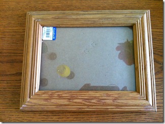
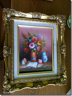
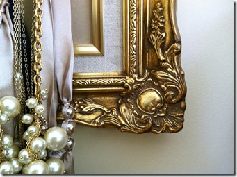
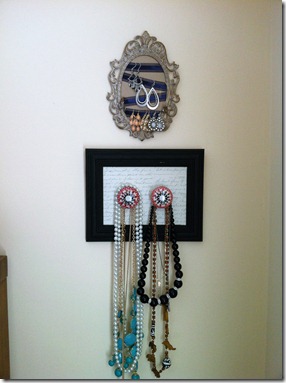
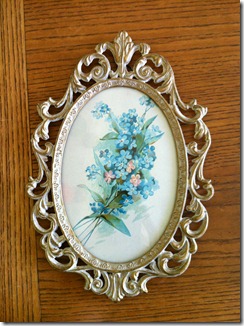
i bought three frames: the two rectangular ones to hold necklaces & the oval one to hold earrings. the oval frame is from this etsy store & the other two frames are from the goodwill (you will likely have to dig a bit, like i did).

first, i took apart the frames. i didn’t need the glass, or the frame backs, just the frame. then, i spray painted the smaller rectangular frame with chalkboard spray paint. {sidenote: i realize that i won’t be able to write on the frame, but i like the matte black color of chalkboard paint.}

after the paint was dry, aaron took over. i will do the best i can to summarize what he told me he did. {sidenote: aaron’s work was on the two rectangular frames, the oval frame was all me & i will describe that process below.}

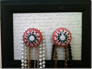
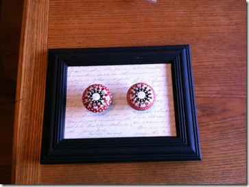
first, he cut plywood pieces to fit inside of the frames. then, i glued paper onto the front of the plywood with craft glue. both pieces of paper are from michael’s; the big frame’s paper is just cardstock that looks almost like a brown paperbag & the small frame’s paper is white with dark grey cursive writing.

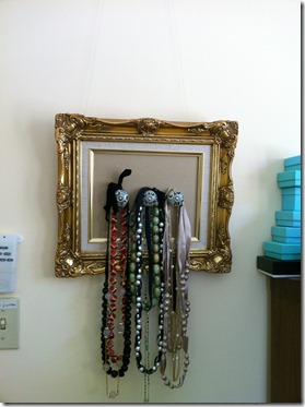
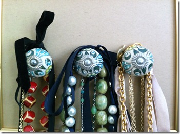
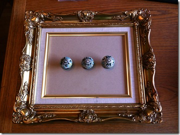
after the glue had dried, aaron worked his magic. i bought ceramic knobs from anthro; two for the small frame & three for the big. {sidenote: knobs from anthro are a bit pricey, but i figured since i got such a great deal on the frames, i could splurge a little on the knobs.} aaron drilled holes into the plywood for each knob. i decided i wanted them centered in the frame, but you could also put them up towards the top too. then, he had to cut down the metal rods that extend out the back of the knobs (what are they called?) with the dremel so they were flush with the back of the plywood. he used big washers (about as big as the knobs) to help keep the knobs in place, along with a nut, & then he added heavy duty glue to the end of the metal rod where it met the plywood.

it was a bit of a process & one that aaron probably doesn’t want to repeat, but it was so worth it. take a look…
IMG_2120

IMG_2121

IMG_2122

IMG_2125

IMG_2124

IMG_2127

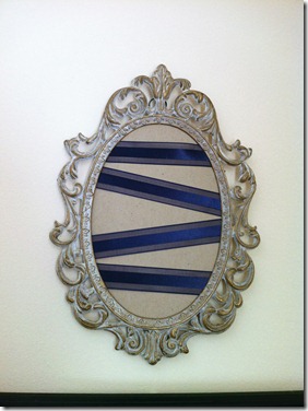
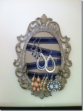
the oval frame, as i mentioned above, was going to hold earrings, so the process was different. obviously knobs are not the most effective method for hanging earrings, so i used ribbon instead.

i took the back off of the frame & removed the glass. then i covered the back with paper (the same paper i used for the big frame above). i cut lengths of ribbon & laid them across the frame back & then glued the ends to the back of the frame with craft glue. i didn’t do perfectly straight lines because (1) it was easier to do diagonals because the frame was oval, and (2) i thought it might be good for different earring lengths. once i was done with the ribbon, i just put the back back into the frame.
IMG_2131

IMG_2132

IMG_2133

IMG_2129

IMG_2130

IMG_2134

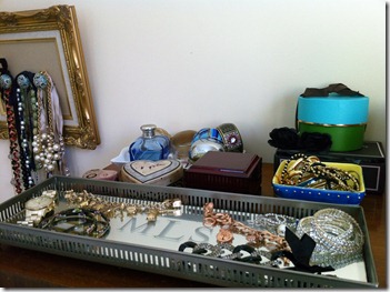
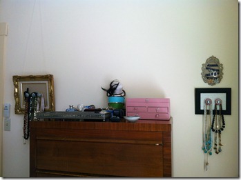
{my jewelry all organized. i am in desperate need of a mirror for above the dresser, but i think i may be getting a new dresser in the near future since i am too short to see the top of it. {hence, why the frames are on the sides of the dresser & not above it.) sad, i know. so, i am hoping to find a shorter dresser that will give me as much storage space & then find a fun mirror for it.}

how do you store your jewelry?

M

updates to the living room: art & curtains.

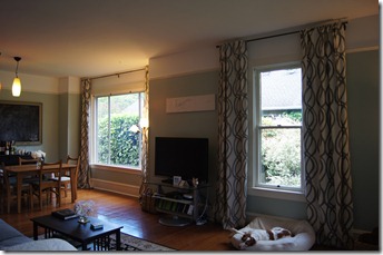
i didn’t grow up with window coverings, mostly because i grew up in the country, but i do like curtains on windows if they are done right. i love the idea of adding a fun texture, color, or print thru a curtain, & that is what i set out to do when shopping for our living room.

i wanted something that was fun & could give us some privacy if we needed (especially on the front window) & also could be lined, if necessary, to help keep out the winter chill. when i started my search, i toyed with the idea of making curtains, but then i considered that our ceilings are vaulted & two of the three windows are big (over 80 inches), i scrapped the idea of making them. i figured it would cost me way more in fabric than just buying curtains, plus i risked having to have a seam in the middle of the fabric. no dice.

so, the search began. it didn’t take long for me to figure out that finding six 108 inch panels would could cost a small fortune. i have been a fan of west elm for a long time (our bed frame & sheet-set-turned-duvet-cover are from here) & we recently got a store downtown (yay!). i have found myself finding more & more things that i like for the house at west elm, including the perfect set of curtains!

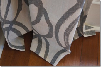
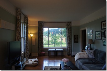
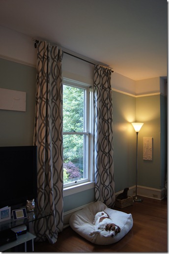
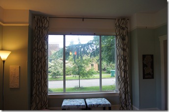
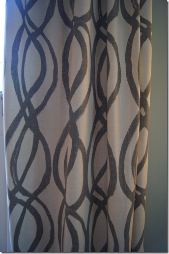
i found these scribble lattice curtains & instantly fell in love. {spoiler alert: these are the ones i bought!} they were fun, grey, & long enough. i held out for about a month or so because even though these curtains were priced well, i needed six of them. i finally headed down to the west elm store last month to see if they had them in stock. well, there weren’t any in stock, but {the good news!} all curtains happened to be on sale plus free shipping (i also had a 10% off coupon west elm sent me when we moved). i ordered them on the spot. {the bad news} they were backordered for three weeks. the original shipping date i was told would have had them delivered this week. luckily, they were shipped early & we were able to hang them the night before our housewarming party two weekends ago {much to aaron’s dismay. he was a trooper though & since i made it easy & marked & measured everything out, he couldn’t say no!}.

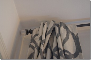
curtain rods, surprise, surprise, can also be expensive, especially since we had two long windows. we had a curtain rod left over from our old living room which would fit the small window, so i just bought two matching ones! {the rods aren’t available online, but i have seen them in stores recently. the rods are a dark grey metal with “glass” balls on the ends.}

we hung the rods two inches from the ceiling & it makes the ceilings look even taller! seriously, it doesn’t seem like it would make a difference, but it does. plus, the curtains pool just a few inches on the floor (which is what i wanted), so no hemming for me!

i apologize for some of the dark pictures. ideally i would have taken these in the morning when the sun is shining thru the living room windows, but we haven’t had much sun lately. {surprise, surprise, i know.}

DSC01124

DSC01126

DSC01127

DSC01128

DSC01129

DSC01130

DSC01131

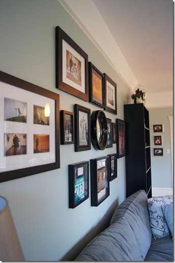
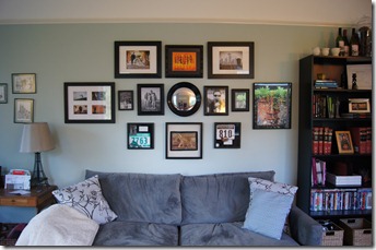
we also decided it was time to hang some art in the living room (as i was tired of the coupons being hung on the walls & worrying about the art being stacked on the living room floor). we had a gallery wall in our last living room & used many of the same pictures, but made the centerpiece this convex mirror i picked up at, you guessed it, west elm. {it isn’t available online anymore, but there was one left at my west elm store – the display – & i talked them into selling it to me!}

DSC01132

DSC01134

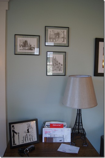
i also tweaked the wall arrangement right above the entryway table. the mr. & mrs. lower artwork was originally also hung on the wall, but it didn’t look right – maybe it was the frames, or perhaps grouping in odd numbers. i am thinking about hanging the letter L in this arrangement too, but for now it works.

DSC01133

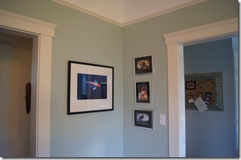
we have lots of art {you should see the stacks we have stored in the office!} & i thought this corner would be a good place to display some more pictures. the large koi used to sit on our mantle at the townhouse & the three smaller pictures are a mix of some of our favorite engagement & wedding pictures.

DSC01135

DSC01136

art & curtains up. it finally feels like we are living here!

have you hung art or curtains recently?

M
a test case: the entryway.

our entryway is small & dark, but takes care of the basics of housing a doormat & a few hooks for coats.

i wanted to jazz the space up a bit by adding some color on the wall, a little artwork, & a few hooks. at some point in the future we would like to add a light in this space, but there is no electrical in the room, so a light will have to wait.

DSC00804

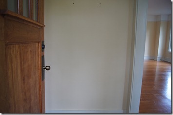
{this is the best & only picture of the entryway before i got my hands on it.}

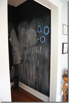
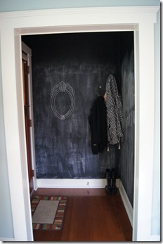
some of my inspiration came totally from my own head. i adore chalkboard paint & pretty much like to use it wherever i can. i loved the idea of having a chalkboard wall (you know, floor to ceiling) but there just didn’t seem to be a good space in our house for it. until i started brainstorming for the entryway. yep, it is covered in chalkboard paint. you may be thinking that i am crazy for wanting to paint such a small space with no light a dark color. you are right, i was probably a little crazy, but the great news is that the room really isn’t too dark, even with the nearly black walls.

the bad news {isn’t there always bad news?} is that i really didn’t consider how messy a chalkboard wall would be. i think all of that creativity got in the way of reality. so, i may eventually try to add some kind of board & batten wall treatment in order to keep that chalk dust at bay.

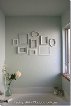
my other inspiration is actually a pinspiration.

33495590948626244_XrlsjA9U_f

{see original post here}

i love this simple, clean look of empty frames. i was able to find a few fun frames from etsy, but am still on the hunt for a few more. i also originally planned to paint the frames white like in the pinspiration photo, but i sort of liked the original frame color & decided to keep it until i added more frames. i am also sort of loving the idea of painting the frames gold.

so without further adieu, our entryway:

DSC01065

{my welcome sign in fauxligraphy & frames. that little teeny white dot next to the lower frame is actually a magnet. i painted a couple coats of magnetic primer underneath the chalkboard paint so the middle of the walls are a teeny bit magnetic.}

DSC01064

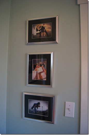
{two sets of hooks for aaron & me. i added a framed chalkboard mirror on this wall too.}

i did actually paint chalkboard paint in the entire little room, even above the doorways, to be consistent because it is unlikely we would ever write anything that high. although my friend amanda suggested that i write something way up high that is semi-permanent. i am still thinking about that. i seasoned the walls by rubbing them with the side of a jumbo piece of chalk. then i wiped the walls with a damp cloth many, many times to try to remove the excess chalk & help with the messiness. the purpose of seasoning a chalkboard is so that when you go to write or draw on it, whatever you write or draw won’t become permanent {well, permanent in that you will always be able to see it even after it is erased}. i am torn about the seasoning of the walls; i am glad i did so that we can erase things, but i am sad i did because (a) seasoning with the chalk is what is making the walls so messy, & (b) i wasn’t tall enough (& was too lazy to get a ladder or chair) so the seasoning only goes up about 5.5 feet. oh well.

i would like to find a fun, colorful, & durable rug for this space, but for now, our old front doormat works. any ideas on where to get a good doormat?

would you paint any of your walls with chalkboard paint, or is it just me?

M
 

source list:

pinspiration: faux calligraphy.

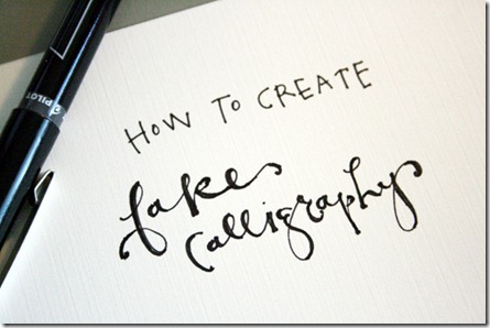
it really isn’t a secret that i love pinterest. the problem is that i pin & pin & pin but that’s it. i attempted to change the pinning into doing at the end of last year with my a pinterest christmas series of diy projects. it was so fun to actually do something with all of those pins! so, i decided that even if it isn’t a regular occurrence, i should really do more of the diy projects that i pin on my boards aptly titled: my ever-growing to do list. so here it goes with my first pinspiration project!

fake-calligraphy1

{faux calligraphy (i prefer faux to fake).}

see original tutorial here: how to create fake calligraphy.

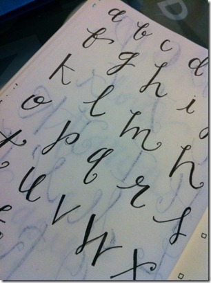
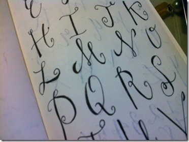
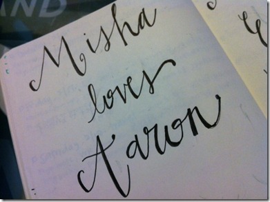
i used my very favorite fine sharpie pen and my moleskine journal (that holds my to-do lists, doodles & notes). the tutorial is really straight-forward & the trick is really to remember how to write in cursive. i wrote my  letters in pencil first & then traced over the letter with the pen before i added the thick marks on the downward strokes.

practice makes perfect, but here is a sample of my first attempts.

photo3

{lower case letters}

photo

{upper case letters}

photo 2

faux calligraphy definitely isn’t as elegant as real calligraphy but it is still fun. i have a few projects up my sleeve that i am hoping to use this form of lettering, so i better get practicing!

{sidenote: this pinspiration project (which i hope to be the first of many) is pretty much exactly what sherry is doing over at young house love with the pinterest challenge. i may add my pinspiration projects to the challenge at some point, but it seems like a little too much for me; over three hundred projects pinned – eeps!}

what do you think of faux calligraphy? are you just a pinner or are you a do-er too?

M